THE ODELLS SHOP
CASE STUDY
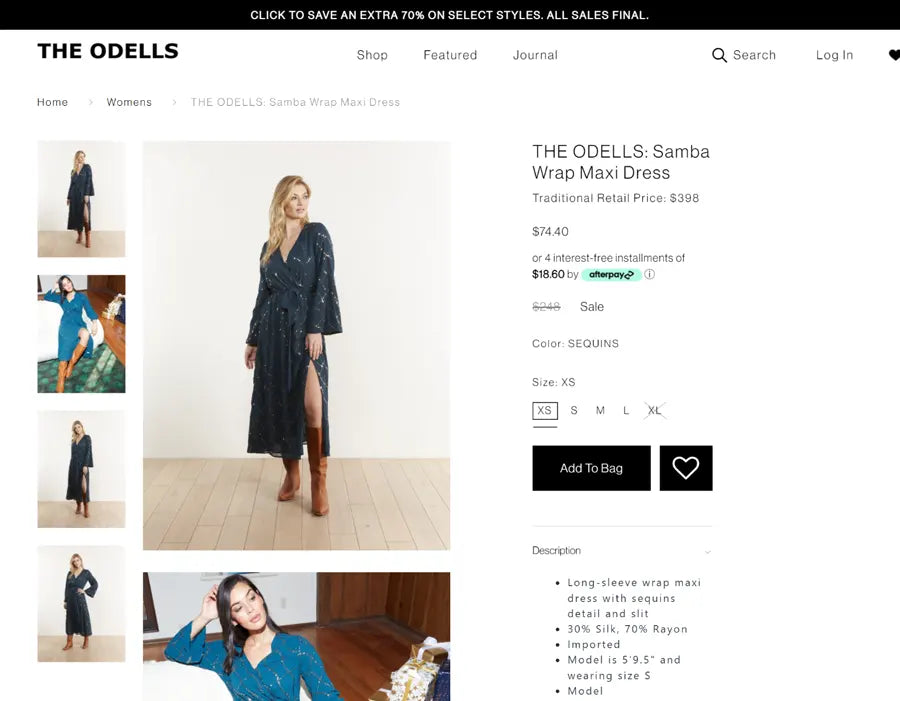
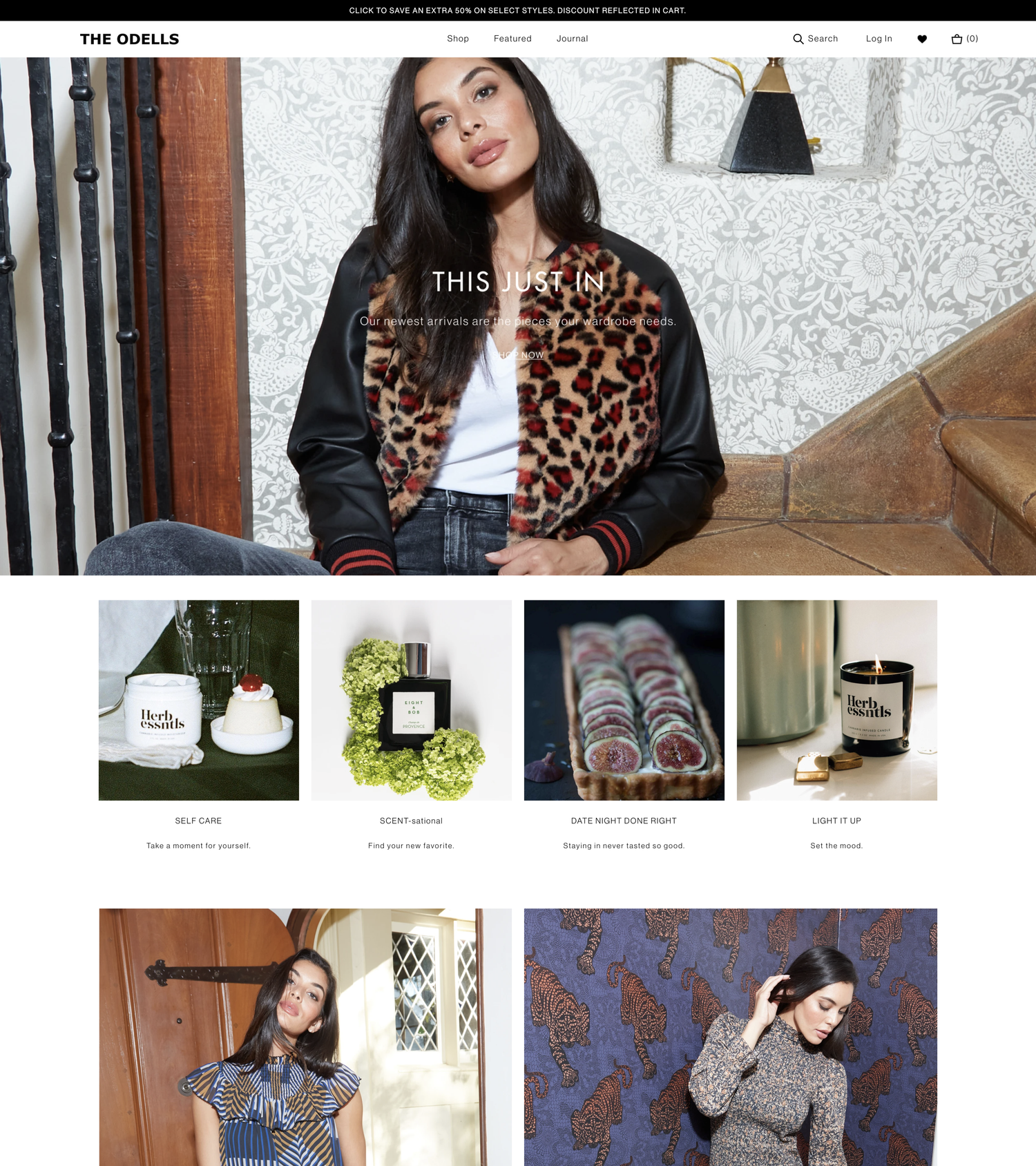
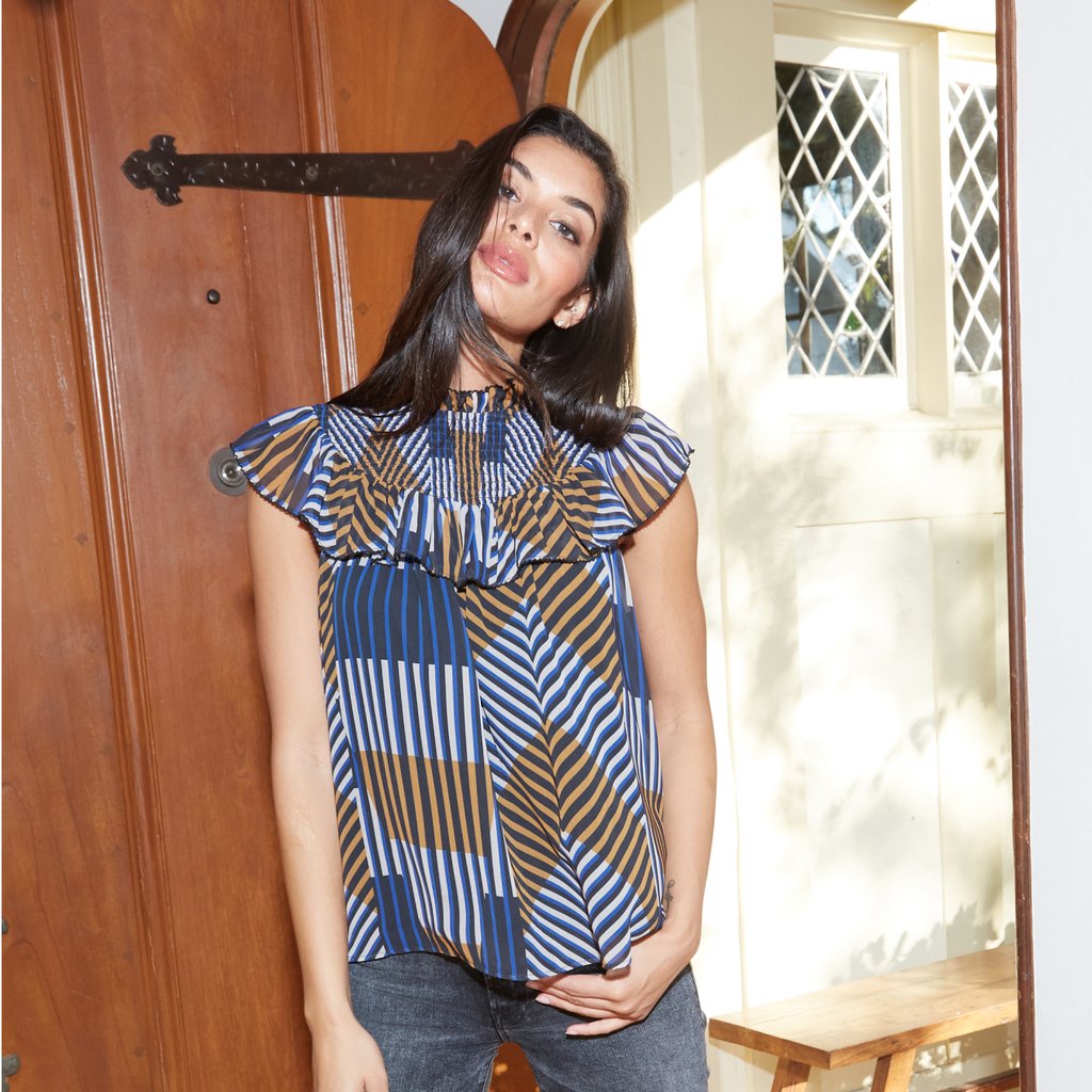
The ODELLS Shop, a clothing boutique in Silverlake, LA has both contemporary and classic clothing for men and women, as well as home goods and accessories.
Share information about your brand with your customers. Describe a product, make announcements, or welcome customers to your store.
When their hip and vintage-inspired aesthetic got too big for just clothes, they evolved to provide customers with accessories, jewelry, apothecaries, and shoes.
Revenue Increase
Bounce Rate Decrease
Page View Increase
Avg. Session Duration Increase
The Challenge
In a year unlike any other, The ODELLS Shop took the last few months of 2020 to reflect and reevaluate the “how” and “why” behind each of their business decisions.
The team had outgrown their previous Shopify theme, and a list of growing issues such as slumping sales and lack of site features meant it was time for a redesign.
Specifically, our team was tasked with the following major points to address:

Inability to Customize Homepage Layout
The previous homepage template was not built to utilize Shopify's drag & drop customizer, meaning that any updates required a developer to go in and code them manually, eating into the Odell's team costs and resources.
Lack of Responsiveness
The site images and layout would not scale down appropriately, leading to content being cut off or appearing distorted on tablet and mobile devices.
Showcase Company Initiatives
With a more thoughtful approach entering the new year, The ODELLS Shop's commitment to transparency and supporting global disaster relief were important steps in letting their customers feel good about shopping with the brand, knowing their purchase was ethically produced.
The Solution

We revamped the homepage structure and logic, allowing the team to control the design and layout utilizing Shopify’s drag & drop feature. We added custom content blocks for a slideshow, Instagram feed, image gallery, video banner and more. This saved the ODELLS team on a lot of unnecessary development hours on future updates.
With images being a primary culprit of significantly high page load times, we compressed them across the site, as well as minified the core files and reduced the amount of JavaScript and server requests.
The entire site was built with a mobile-first approach, ensuring the user experience remained consistent across devices - no more content clipping or poor mobile navigation UX.
see more case studies
WANT TO LEARN MORE?
Subscribe for updates to learn more from e-commerce strategies to the latest trends. It’s all served with a side of wit, minus the over the top techie jargon.
- Choosing a selection results in a full page refresh.
- Opens in a new window.


